most EV’s have a gearbox, as they don’t use direct drive systems. usually a single gear but there’s still a “transmission” of power through a gear reduction to mate up the electric motors to the axle(s).
It’s rpm plus torque. CVT will only keep it at optimal rpm so it can still drop below peak efficiency. Hybrid transmissions help but if you look at diesel-electric trains they are either flat out or off - which is why you occasionally hear them move off with no action from the engine.
1 Like
It’s equivalent to the final drive on a manual gearbox. It’s just the rest of the gubbins that’s missing.
that’s out of necessity for the massive amount of torque required to move 10,000 tons.
“If the events related by the UN rapporteur were taking place in Russia or China we’d be appalled”
Says it all.
4 Likes
It’s beyond irresponsible.
1 Like
I’m not sure what your point is here. Different days have different weather.
3 Likes
easy to see. caught it right away.
@RedWhippet was just being polite!!!
The trolls have taken over the thread … !
2 Likes
True.
what gets me is that these so called messaging “tactics” are used by the media (which is the point I presume), politicians, Trump (not a politician), conspiracy theorists, and even football fans. The only people that don’t really go down that route are the serious scientists that simply produce papers, measure stuff, calculate stuff and so on. Apparently we cant trust those people…
3 Likes
I mean, they’re called messaging tactics, but if I recall correctly, the reason why the colour scheme was changed was so it could be made more visible to people with colour blindness or something like that?
No idea tbh. I guess we’re drifting into that area of clickbait, fake news, spin and all that kind of stuff.
That explains it.
Colour blind people who cant read ![]()
It’s about how to present information in a way which is more accessible and highlights the message better.
Otherwise you might as well just have it in monochrome, no?
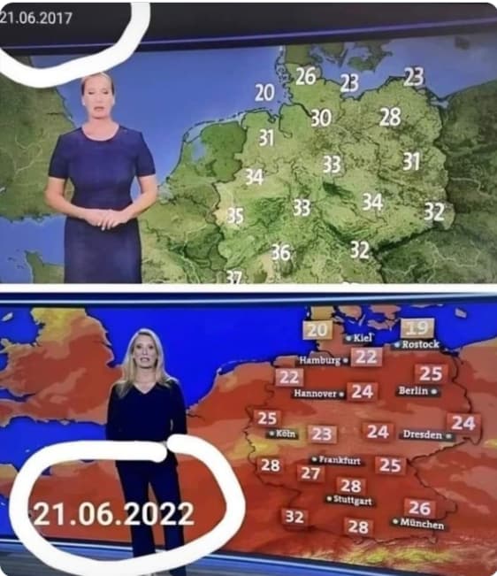
OK, I am colour blind. I was assuming the top map was just a landscape map and the bottom one a temperature one. Or have I completely missed the point again?
The point, such that there is one, is the implication that concerns about global warming are manufactured because temps in the 20s are today being portrayed in scary fire hot red whereas previously this graphic was not used for even hotter temperatures.
1 Like
I feel you are actually giving @dane too much credit: I think his point is simply that the same date 5 years prior had warmer temperatures.
Climate Change deniers really reaching these days.
2 Likes