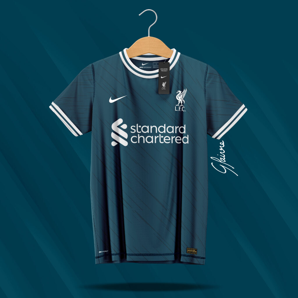
I really REALLY like the look of that third kit.
The new Standard Chartered font is so much better.
I really REALLY like the look of that third kit.
The new Standard Chartered font is so much better.
That away kit looks like someone has wiped their shoes all over it.
These look even worse in person. Absolute horrendous. The home is one of the most uninspired I’ve ever seen. I have all 3 of them in my hands at present and only the 3rd is adequate. The photos make it look much nicer than it really is. All we heard from Nike was about how they were giving Liverpool custom everything and fresh designs every year and more sensationalist marketing nonsense. Nike use the same die cut patterns on all their football shirts. Nothing changes with the shirts construction from club to club. They just change the colors and graphics.
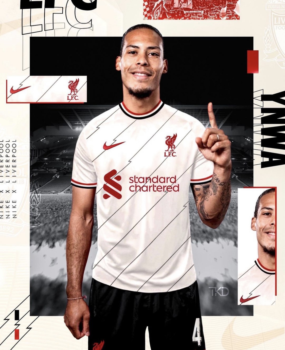
And as an side, that photo of Virgil is also a deep fake. I think it was done by a graphic designer.
Like the kits but hope the lines going at an angle are swapped around. Weird but just looks odd like they should be the other way around
Even the yellow one? Looks nice from the pictures.
The yellow one is definitely the nicest of the 3 and has the most personality and charm. It’s just not quite as nice in person as it appears in the photos.
I’m not trying to sound overly negative on Nike, just thought they could have done more with it. Just a bit more attention to detail. A V-neck would have been absolute class. And maybe it’s just the prototype I have but the elastic on the sleeve tips make the sleeves balloon out.
EDIT: Nike gave Netherlands, Poland, and Portugal really nice collared shirts this year. Would have been nice to get something distinguished in that same realm. It feels like they put more effort into the National teams overall than they did clubs.
They will probably release a £100 version again which will feel nicer.
Agree that the necks don’t look great and V would’ve been much better.
I’m just glad I don’t buy them anymore. I’m more interested in the training range.
The only reason why the yellow one looks better than the rest is because of the retro vibe.
Not even have to start thinking about colors and design because the quality and the fit looks shit again. Like some fake stuff you can buy for 10€ at the beach on holiday.
Even the first Warrior kits were better than this crap and we are talking about Nike ffs.
Wouldn’t buy this even if we win all possible trophies and/or buy Mbappe.
I quite like that yellow… should have stuck to that design across all three, that home one I couldn’t care about black on it, the sleeves with that pinkish red ruin it.
I think this photo is official. And again, won’t belabor the point but this shirt could have been so much classier with a v-neck or polo style folded collar with button closure. Just my opinion.
Looks photoshoped to me.
Could be photoshopped but footwear brands often do that. Official marketing pieces and photoshopped aren’t always mutually exclusive.
EDIT: just got a text from my son. That is not a Nike marketing piece for the new shirts. I completely missed the graphic designers watermark.
Footy Headlines is usually a strong source but they’re wrong on this one and that was an article they were asked to write IMO. Someone reached out to them to publish that article. For instance, how would they know about an “eco tag” on a shirt that hasn’t been released yet? Lol. Someone asked them to write this article.
What they’re not telling everyone is that while by definition they are “fake” because of the errors, those shirts have literally come out of the exact same shop as where the “real” shirts are made. These are actual production pieces that were rejected for one reason or another and are coming out of the back door (so to speak) to sell on the secondary market.
Again, I’m not guessing at any of this. I know it first hand.
The white is nice.
So is the yellow.
The red shirt should only ever be red and white/yellow
The ‘lightning bolt’ falling right inside the SC n bothers me.
I am not a fan of the Man Utd-esque flashed of Red, White and Black
The home shirt would be very nostalgic for me. My first ever Liverpool shirt was a hand me down (from my Brother) one the Reds wore from 1957-62. Somewhere in it’s life it had been washed in “too hot” water and so the red had stained the badge, collar and cuffs pink. I wore it with below the knee shorts, red woolen socks and again hand me down rugby boots. I wouldn’t have been out of place taking part in the match featured in Kes.
I don’t like the home or away ones but the 3rd one i could go for