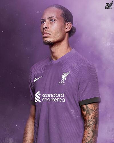
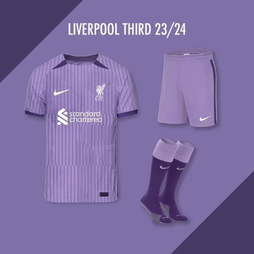
I quite like to be fair, looks like someone actually designed that instead of leaving their kid in front of paint.
Nah, I prefer the one up a bit. Although the one posted by @rab could look decent if they extend the block patterns, but with a fade into white.
Fuck me !
Sponsored by Minecraft ![]()
Seriously?
It’s resembles a shit Saturday afternoon amateur club house.
There were blag copies of this season’s white away top knocking around with a round black collar on in pre season. Did Nike just buy them up and splash a bit of green on them? I’d have preferred this to be solid green and white quarters. Similar to the 96/97? away. With solid quarters and black shorts and socks I’d probably like it. Not so much the version shown above. ![]()
Don’t remind me we will be in that magic eye kit this weekend.
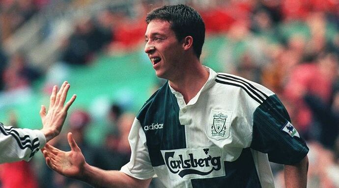
That quarters Green kit was my second favourite in my youth, the Gold one was my favourite.
We’ve hardly worn this years green third kit. Much nicer than the magic eye one IMO. ![]()
That’s better, yeah.
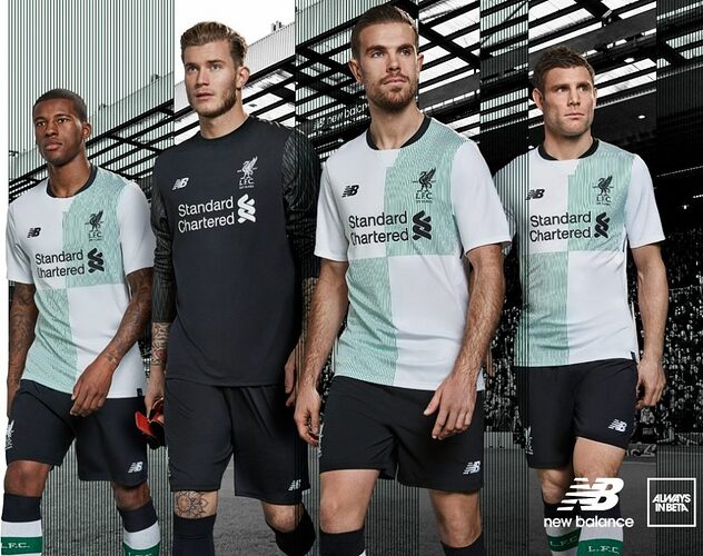
I kind of liked our white with green details away kit in 17/18.
Normal, a bit of history, but not aggressive.
Yeah I quite like that but anything dark red or red and black and it has to be magic eye.
They could just simply leave out the green and we have a winner…
I love the green kit. Wish it was the official second. Really don’t like the psychedelic shit one.
Do we have any good results in it?
They usually have one good result in even the worst of kits.
Rome memories!
It’s that made up one or from somewhere?
![]()
Seems like you must have a horrible one these days. To have 3 ‘normal’ kits is not possible anymore.
It’s a bit wishy washy…we need statement colours…big n bold to get in the face of opponents…


