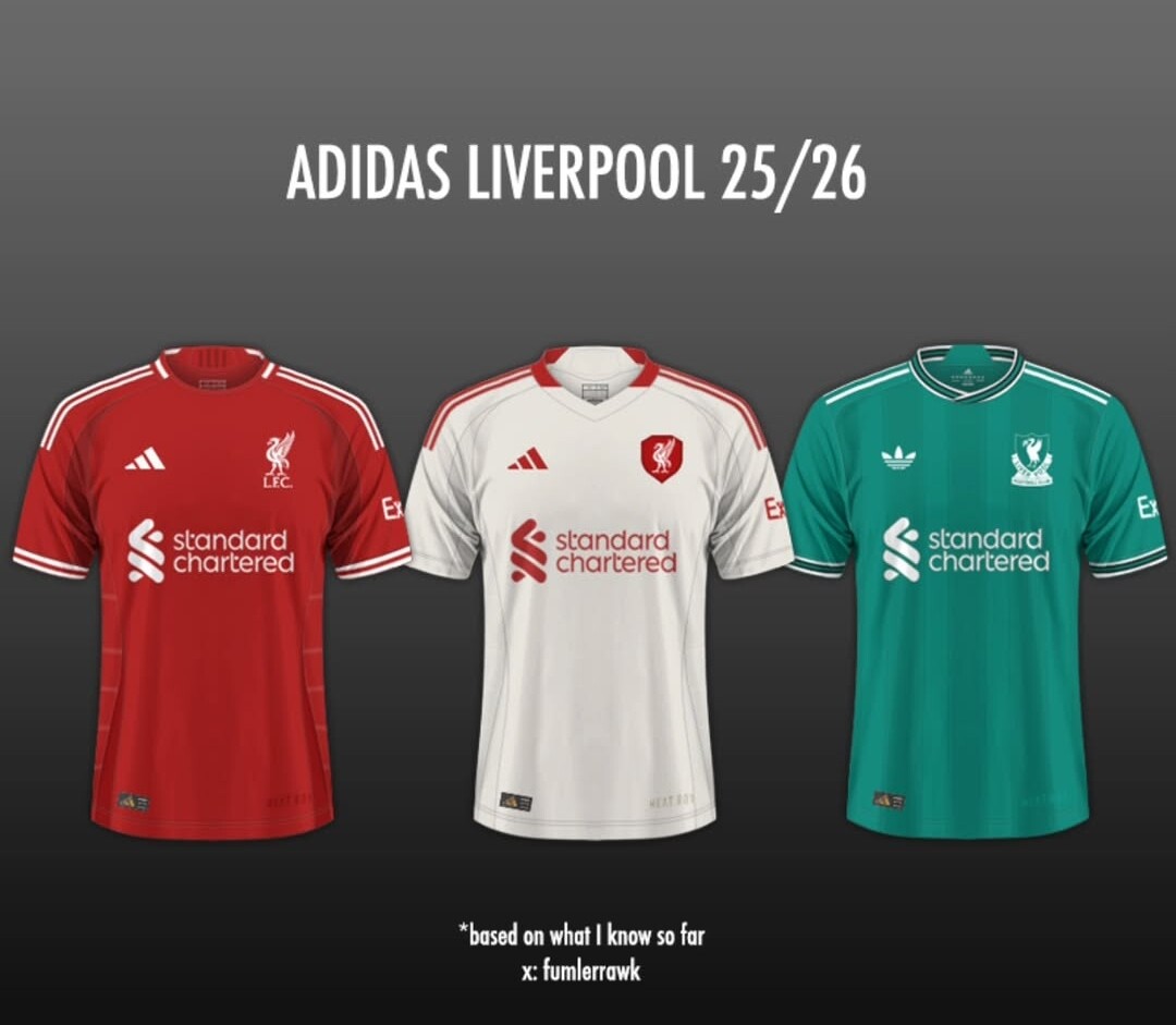
i see Macherano when i see that Red - love the old school badges. One on the green is my all time fave lfc badge
Yeah… this is much more us.
Looking forward to it even more now.
1 Like
Hopefully this bridges the gap toward the bumper deal Man Utd got. I get that they are a global juggernaut, but it has been a fallow decade, and surely we are closing that gap now, and we should be looking for 60M minimum, with a chance, with sales, to get towards the 90M they got.
Where the ……. John.
2 Likes
Yeah the fact we are quoted as taking 60m (after 30m from Nike which with shirt sales etc came ‘close to 60m’) whereas United are still taking 90m is a bit concerning. Surely any kit deal over the last 3 years would be for at least similar to what United would earn?
1 Like
1 Like
Do modern players have an issue with collars.
1 Like
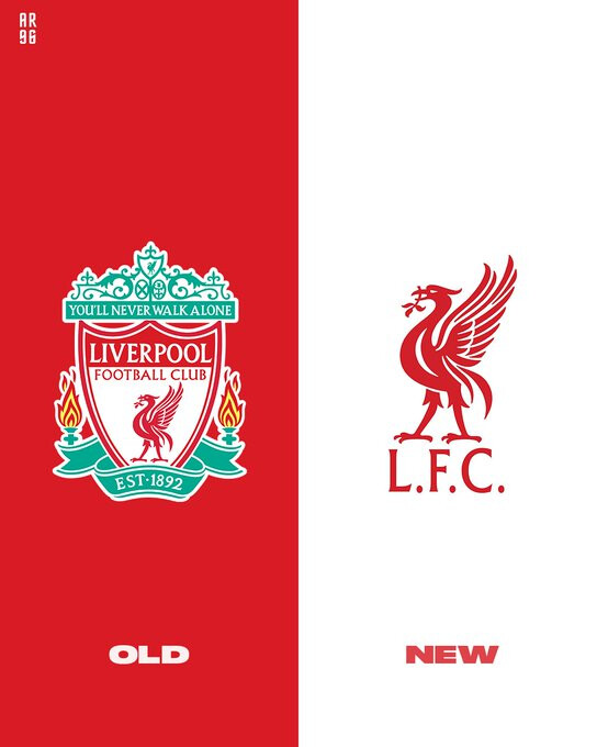
When you’re asked like that, it’s just natural for me to prefer the old one.
It’s actually really nice, not messy, has multiple details that go well together and it’s original.
Now, I do understand the arguments behind the new one (especially for marketing, brand and product reasons), though I’d say that I don’t like the whole minimalism in everything wankfest.
You can have too much details, but you can also go too far with minimalism also. Certain things or designs become too cold or too ordinary. Juventus’ new one is something I’d never support or grow to like. Our new one is alright, we haven’t invented something, but we’ve removed a lot.
The whole Liverbird story also… not sure I’d leave almost all the focus to it, either.
Surely some things are not to be touched/changed just because it fits well within a social media profile picture, more distinctive tattoos or a small product in the club’s shop.
These things might change again.
4 Likes
I think it is a bit messy to be honest anyhow the new one is pretty my much the old one.
1 Like
I like the new one, and agree it is basically the old old one!
I do like the intricate logo with all the meaning behind the different parts. It tells a story so there’s a lot of merit in keeping it.
But as a slight preference, I just like clean and clear, and the liver bird is it. Liver bird. LFC. Job’s a good un. And instantly I see a sweeping end to end move with a cracking Terry McDermott header to finish it off.
4 Likes
I think the current badge strikes a good balance on being simplified without feeling cartoonishly minimalist. The biggest criticism would probably be not retaining the eternal flames.
4 Likes
I really like it, it is embroided well on to the shirts as well. Could have kept the flames or at least embroid the thing on to the next.
3 Likes
I like both.
Like the old one a bit more even if the new one is fine.
1 Like
Well that was a weird idea from the guy.

1 Like
2 Likes