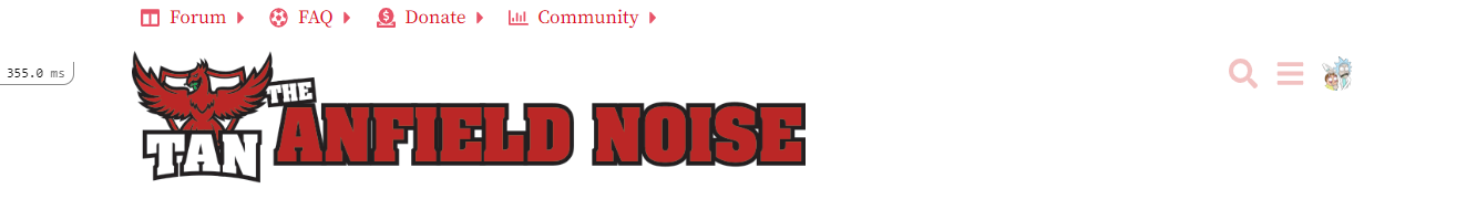
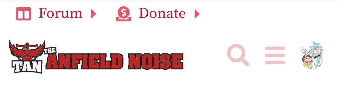
Large Banner + Drop down menu (Like Default Skins)
Large Banner + No Drop Down menu
Small logo + No drop down menu ( Like New Skins)
Small logo + Drop down menu
No logo - Simply text banner+ Drop down menu
No logo - Simply text banner + No Drop Down menu (like Beta skins)
0voters
Before we open TAN up to the general public, I would like TAN to consolidate its look and feel. So I need the help of the community to determine the best path.
Lots of colour options (and maybe font opinions) will remain but I would like to decide if we have a drop down menu or not. Do we go for a big banner logo or a small logo with dynamic text.
I will be having further polls for different aspects of the site (Footer, colours, avatar size etc). This thread is simply for how we want to header to look and feel.
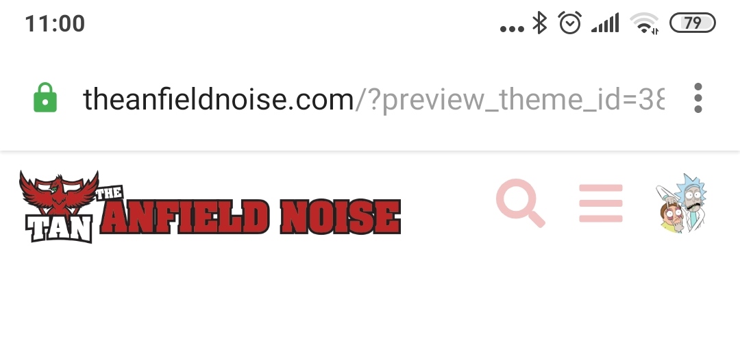
These can be viewed also by changing your skin - by clicking on the hamburger menu.
I like less real estate being used. Height is the premium dimension, so small works best for me. I like the pulldown options, like the general layout too. I even prefer using the PC version, but use mobile equally.
As I have it. Would also be interesting to know the number of people who only ever use mobile. That’s me for sure. Even when I’m “working” on a PC, I still have this on my phone. Guess it’s just habit:
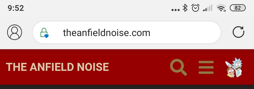
Like the big banner, not a fan of the dropdown menu… largely because half the time when I scroll up and click the logo to refresh the page I end up selecting the Privacy statement