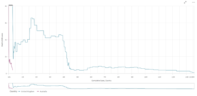
Moving this over to the Covid thread, I’ve been looking into the data a bit more and been graphing the data in Qlik, using case-fatality ratio mapped against cumulative cases, as I think that cumulative cases (rather than date) is better for this comparative analysis where Australia you could say is in its infancy of the pandemic due to very minimal community exposure.
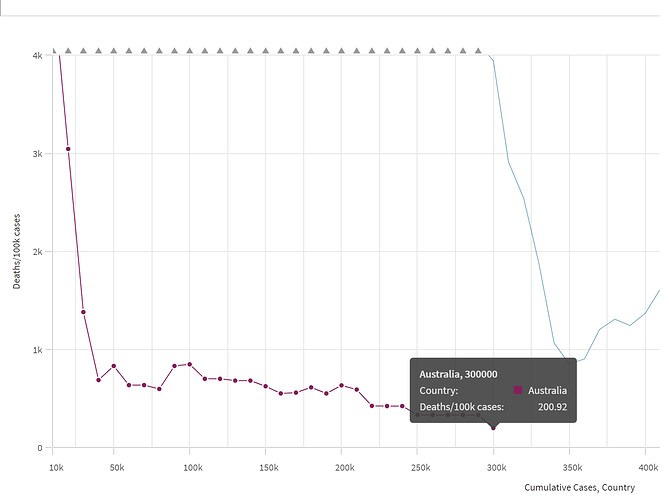
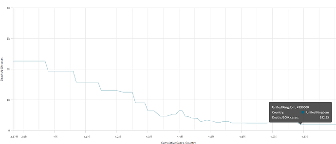
Australia is currently sitting on 200 covid deaths per 100k cases after just under 300,000 cumulative cases over the course of the pandemic. UK went under 200 deaths/100k after 4.8 million cases, which would have been around July 2021. The graph really highlights how Australia have been able to make the case-fatality ratio nosedive on vaccine alone and catch up with the likes of UK without having to have large scale exposure and infection. Sure, Australia are fortunate to be opening up in the Summer and things might turn South when Winter approaches but its looking good for them where I’m sitting. UK since 18th December are down to an all-time low of 60 deaths per 100k cases, but prior to this since July have been hovering between 200-400 deaths/100k.
Disclaimer: Deaths have been offset by 2 weeks to tie into the cases they would be associated with. Its not highly accurate but obviously its more accurate than using date of death. Because of this offset, data is only to the first week of January 2022.


