Mmmm the red looks a bit pink on that. Maybe the photo!

1 Like
Over designed. Don’t like the black on the collar etc and the red under the arms is ugly too.
Keep it simple!
2 Likes
Red and black on a Liverpool kit? The shield with the badge looks bad too.
2 Likes
Just about to say the same. The collar is far to Mancunian for me
Is the Green one still the third shirt.
As it seems, yes, I haven’t heard anything else.
1 Like
Hope so as that looked amazing.
This looks fine there is only so many colour schemes so if it resembles some team that used to rival us who cares.
2 Likes
The black keepers kit shouldve been 2nd kit and green 3rd.
1 Like
Miss the yellow kits.
Looks like Wes Brown in United colours.
1 Like
Nothing there?
It was a picture of the trophy cabinet in Everton’s new stadium
4 Likes

That’s where the revenue is coming from.
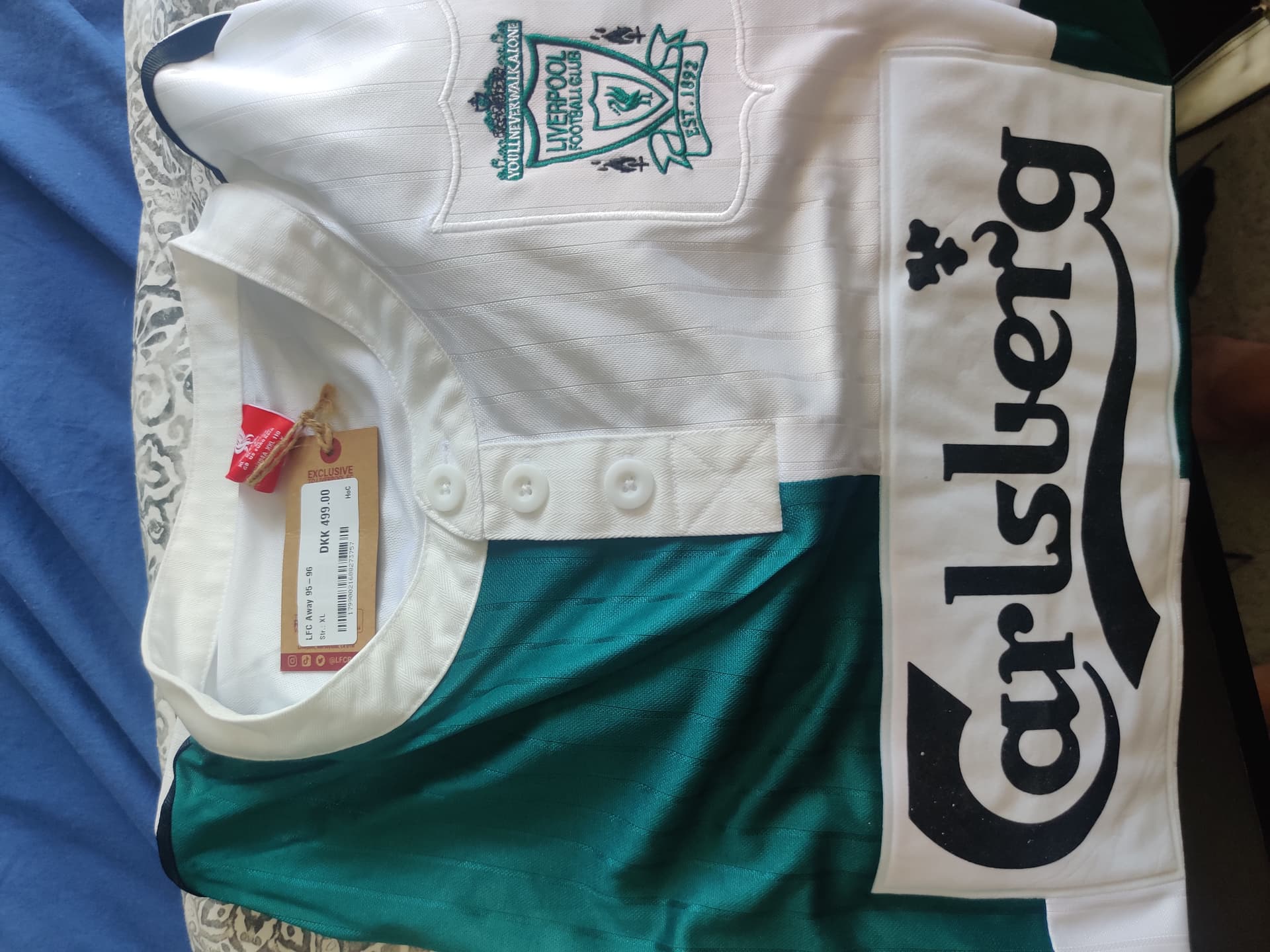
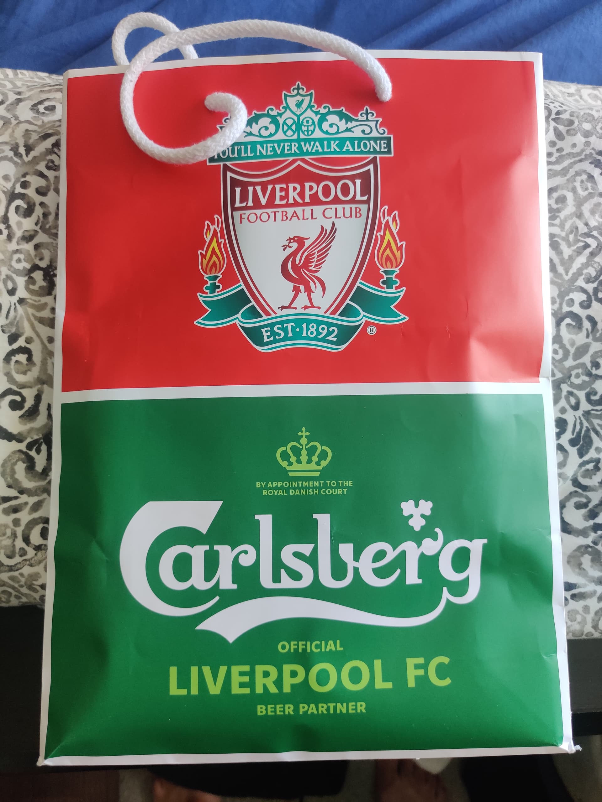
As a Liverpool fan I’ll definitely be using them for all my forex, indices, equities and commodities needs.
1 Like